
Sunday, 13 May 2012
Friday, 11 May 2012
Tuesday, 8 May 2012
Evaluation Question 1
Music Video:
Magazine Advert:
The first thing I did before creating the mag ad was research into the general format conventions, by de constructing a number of different genre adverts from the music magazines Kerrang and Q. A few examples are Various adverts from Q, Green Day and 30 Seconds To Mars.
The codes and conventions I found of the magazine advert format included:
For research in preparation of our own digipak, like with the mag ad and video, we looked at general examples of existing digipaks, so that we could get an idea of the common codes and conventions of the format. We looked at examples such as Ignacio Fernandez, Jack Johnson, and Bryan Adams. Here are the codes and conventions that we found for the format of digipaks:
Magazine Advert:
The first thing I did before creating the mag ad was research into the general format conventions, by de constructing a number of different genre adverts from the music magazines Kerrang and Q. A few examples are Various adverts from Q, Green Day and 30 Seconds To Mars.
The codes and conventions I found of the magazine advert format included:
- Album release dates
- Band logo/ images
- Album information
- Record company logo
- Album artwork
- Website URLs - band and record company
- Large fonts
- Info on what's included (extras etc.)
- Text over the top of background images
- Tour dates
After researching the general codes and conventions of the format I think briefly looked into specifically Industrial metal mag ads, such as the advert for Nine Inch Nails - The Downward Spiral. The differences I noticed between the general examples and the Industrial metal examples were:
- Industrial metal examples use generally darker colours
- They are more simplistic
- The band logo is a big focal point
I then used these codes and conventions to plan creating our own magazine advert, after creating 2 drafts, the finished mag ad included:
- Tour dates
- Multi-layered background
- Band website URLs
- Band logo
- Album ratings
- Social networking links
- Release date
- Production company logo
Digipak
For research in preparation of our own digipak, like with the mag ad and video, we looked at general examples of existing digipaks, so that we could get an idea of the common codes and conventions of the format. We looked at examples such as Ignacio Fernandez, Jack Johnson, and Bryan Adams. Here are the codes and conventions that we found for the format of digipaks:
- Cover Image/ background
- Stickers
- Band photographs
- Correlation between front and back cover images
- Bar code
- Copyright info
- Track list
- Band/ Artist logo
We then looked briefly into a similar genre digipak (AC/DC), and found that there were a few differences for this genre of digipak, such as; very simple layout, not many images and darker colours. We then incorporated these codes and conventions into our own digipak.
Finished Magazine Advert
This is the final magazine advert, with the appropriate changes having been incorporated in relation to feedback.


Tuesday, 6 March 2012
KM - Deadline updates
We now have a new deadline for the final cut, digipak and magazine advert; Monday 6th March. We are spending the lesson and free time today trying to get everything polished up and ready to hand in at 3:00. We are also putting together a vodcast, using images to present evidence of how we have used DCRP and MRGER.
Wednesday, 22 February 2012
ALL - Industrial Metal Vodcast
This is a vodcast discussing the research we all did into the industrial metal genre to see what we saw as codes and conventions and things that were recurrent themes in the world of industrial metal music video!
HBK Vodcast on Genre from Benji Hudson on Vimeo.
HBK Vodcast on Genre from Benji Hudson on Vimeo.
KM - Group Progress Update
Over the last few days I have been working on a new draft of our magazine advert, I started again with the same background, using the same images, but the layering is going a lot better this time around. Hopefully it should be finished by tomorrow, and then I can ask for feedback/ improvements.
Over the holidays Ben has been doing some more filming for the narrative side of the video, so we should have a new rough cut sample finished over the next few days
Harry has recently started work on the first draft of the digipak, after finishing research into different digipaks, that should be finished hopefully by the end of the week
Tuesday, 21 February 2012
BH - Location, Location
To put it simply Bradford is the perfect location for the music video- not only as a former industrial town itself (not in that sense!) but as a town with a clash of different and opposing idea's- the old Victorian style which clashes with the more modern aspects of the town in a whole host of different locations. Then there's the Bolton Wood quarry, where the final 'section' of the music video takes place. And various sections are filmed very close to it.

So here is a shot of the quarry from an angle similar to our closing shots of the main narrative, obviously very high up with a near panoramic view of Bradford, ideal for a closing location, with this it's a case of how we fit everything we want into the frame rather than what we don't want in the frame.
 The location once again from a different angle, as you can see it lends itself to the look desolation and isolation, it looks quite far from locations nearby and generally a wide open space, now for obvious health and safety issues we can't film IN the quarry- which makes the ending problematic somewhat, as the final shots of the main narrative is a shot of the protagonist lying on the floor on the quarry, but luckily we can substitute here as the shot will be a close up/ extreme close up it makes it extremely easy to find an ideal location.
So here is a shot of the quarry from an angle similar to our closing shots of the main narrative, obviously very high up with a near panoramic view of Bradford, ideal for a closing location, with this it's a case of how we fit everything we want into the frame rather than what we don't want in the frame.
Tuesday, 7 February 2012
HK - Digipak Research Evaluation
From the examples of Digipaks I have looked at you can see they are all of a similar sort of format though there are some difference between genre's as I have looked of examples from a range of genres and have also looked at digipaks for the metal/ industrial metal genre and seen different codes and conventions between them.
 Cover Image/Background
They usually have a cover photo which is known as the albumn artwork, sometimes this is just a plain image of the band for example the ignacio fernadez example I looked at, or can be a slighty more obscure cover image that is edited like the 18 till I die album.
Though for examples of the metal/industrial genre I looked at were all more minimal and didn't have a glossy, eye catching cover photo but seemed to have colours like greys and browns for the AC/ DCand Dragon Tatoo examples these were just textured backgrounds which was very opposite toIgnacio Fernandez which had a very vibrant, clear and colourful photograph as its cover image.

On the Front typically includes text saying the album and artist name.
In a very large font that takes stands out from the rest of the cover.
The band logo is usually included on the front cover this is seen largely in NIN digipaks with the NIN logo taking a large focus on the cover usually positioned in the middle of the cover this is the case with the nine inch nails album WITH_TEETH.

Stickers
The front often includes stickers which are eye catching and usually give a brief idea of what's on the CD for example 'includes number 1 single Metal'
 The sticker was a large focus on the AC/DC Back In Black album as the sticker in the bottom right of this cover almost took up a quarter of the front cover. The use of stickers was also included on the cover for Jack Johnson's album.
Which had a shiny 'Special Edition' sticker and a plain black oval shape that looks like a sticker but has actually been printed on the cover rather than a separate layer stuck on.
Inner Panels
 A reacurrent feature I saw for the inner covers was the use of photographs of the band, this was seen in the AC/DC back in black album and also a digipak for Take That, these both included photographs of the band.
They sometimes have some sort of connection to the image on the front cover this was shown in the NIN Pretty Hate Machine album, as the image on the inner panel was actually the same image as the front cover just edited differently and changed from a CU to an ECU.
Back On the back I found from research that there is often correlation between the image on the front and on the back, like the photo on the front would be shot front on and the image on the back would be shot from behind.
This was on pretty hate machine, the cover photo just edited differently.
On the back of every Digipak I looked at is text information on the tracks, also sometimes includes the length of tracks, though for Dragon Tatoo there was no information on what tracks there were inside but for
Ignacio Fernandez it had information on the tracks and how long they were.
The backs always included copyright information, company logos/idents and usually the URL of two websites; The artists official website and the production company's website.
Something that every single Digipak shared was that they all had bar codes located on the back.
 Cover Image/Background
They usually have a cover photo which is known as the albumn artwork, sometimes this is just a plain image of the band for example the ignacio fernadez example I looked at, or can be a slighty more obscure cover image that is edited like the 18 till I die album.
Though for examples of the metal/industrial genre I looked at were all more minimal and didn't have a glossy, eye catching cover photo but seemed to have colours like greys and browns for the AC/ DCand Dragon Tatoo examples these were just textured backgrounds which was very opposite toIgnacio Fernandez which had a very vibrant, clear and colourful photograph as its cover image.

On the Front typically includes text saying the album and artist name.
In a very large font that takes stands out from the rest of the cover.
The band logo is usually included on the front cover this is seen largely in NIN digipaks with the NIN logo taking a large focus on the cover usually positioned in the middle of the cover this is the case with the nine inch nails album WITH_TEETH.

Stickers
The front often includes stickers which are eye catching and usually give a brief idea of what's on the CD for example 'includes number 1 single Metal'
The sticker was a large focus on the AC/DC Back In Black album as the sticker in the bottom right of this cover almost took up a quarter of the front cover. The use of stickers was also included on the cover for Jack Johnson's album.Which had a shiny 'Special Edition' sticker and a plain black oval shape that looks like a sticker but has actually been printed on the cover rather than a separate layer stuck on.
Inner Panels
 A reacurrent feature I saw for the inner covers was the use of photographs of the band, this was seen in the AC/DC back in black album and also a digipak for Take That, these both included photographs of the band.
They sometimes have some sort of connection to the image on the front cover this was shown in the NIN Pretty Hate Machine album, as the image on the inner panel was actually the same image as the front cover just edited differently and changed from a CU to an ECU.
Back On the back I found from research that there is often correlation between the image on the front and on the back, like the photo on the front would be shot front on and the image on the back would be shot from behind.
This was on pretty hate machine, the cover photo just edited differently.
On the back of every Digipak I looked at is text information on the tracks, also sometimes includes the length of tracks, though for Dragon Tatoo there was no information on what tracks there were inside but for
Ignacio Fernandez it had information on the tracks and how long they were.
The backs always included copyright information, company logos/idents and usually the URL of two websites; The artists official website and the production company's website.
Something that every single Digipak shared was that they all had bar codes located on the back.
HK - Codes and Conventions of Digipaks
After looking at a range of different digipaks it was clear that there were codes and conventions that were similar throughout each digipak.
- Album and Artist Name - Every digipak I looked at had the name of the album and who it was by on the front cover of the album.
- There is always either a picture or a textured background as the front cover.
- The inner panels often include a photograph of some sort and the images of the panels are usually similar, if not the same image but just edited differently.
- The image on the back is usually linked to the image on the front.
- There is always a bar code on the digipak.
KM - Nine Inch Nails magazine advert (The Downward Spiral)

- Mention of b sides and deluxe edition
- Rusted metal background
- Large black font
- Parental Advisory sticker
- Logo blended into background
- No tour dates
- Website URL
- Record label logo
- "In Stores Now"
KM - Feedback from Mag Ad 2nd draft
Here are some of the main feedback points I received from the 2nd draft of the Magazine Advert:
- The social network (facebook and twitter) icons need to be downsized
- Add itunes info
- Make all the images better blended together (no block images)
- Add tour dates
- Kerrang! and Q logos
- Change some of the text sizes
- Make the name of the album bigger/ clearer
- Include "Best of Nine Inch Nails"
Sunday, 5 February 2012
KM - Creating The Magazine Advert (Background)
The first thing I did when starting on the magazine advert was to get a good background of blended images to put the information about the digipak etc. over the top of. For the images I used screenshots from our original sample footage, here are links to the 5 images I used:
Image 1
Image 2
Image 3
Image 4
Image 5
I used the image of the Graffiti cat and the image of the CCTV sign as the base for the background after first changing the background colour to black.
After inserting the first 2 images into Photo shop I added a 'layer mask' to the image of the cat and then used the gradient tool to blend the 2 images together (after overlapping the images where I wanted them on the advert). I also used the gradient tool to blacken the edges of the advert, so that the writing that I was planning to put at the bottom (URLs) would stand out sufficiently.
After I had the first 2 images looking how I wanted I then added the next two (the puddle and the corridor) in parallel above them and again used the layer mask and gradient tool to blend them on top of the other images. I then did the same with the candle image, placing it in between but slightly above the top two images of the puddle and the corridor.
Image 1
Image 2
Image 3
Image 4
Image 5
 |
| The first 2 images before blending |
After inserting the first 2 images into Photo shop I added a 'layer mask' to the image of the cat and then used the gradient tool to blend the 2 images together (after overlapping the images where I wanted them on the advert). I also used the gradient tool to blacken the edges of the advert, so that the writing that I was planning to put at the bottom (URLs) would stand out sufficiently.
After I had the first 2 images looking how I wanted I then added the next two (the puddle and the corridor) in parallel above them and again used the layer mask and gradient tool to blend them on top of the other images. I then did the same with the candle image, placing it in between but slightly above the top two images of the puddle and the corridor.
 |
| Finished background |
 |
| Blending the first 2 images |
KM - Magazine Advert 2nd Draft
Here is our 2nd magazine advert draft: (click here for full size image)
 I made a couple of changes after receiving feedback from the rest of the media group; I first swapped the full URLs of the social networking sites with icons, as this looks better and most people are familiar with these icons. I 'onion skinned' the icons on Adobe flash, and changed the colours before adding them to the ad. I then used the 'layer mask' and 'gradient tool' on Photoshop to try to better blend the pictures together, in particular the "Beware of the CCTV" image, as we received feedback that the edges of this image were too defined. A problem I came across when doing this was the fact that when trying to blend the middle of the image to the background, the CCTV sign became harder to make out, so I focused on the sides of the image, so that you can still read the sign, but the edges aren't as noticeable. I also tried changing the fonts, but after trying various different ideas, I changed them back to my original fonts of; 'charlemagne standard' for the writing at the top of the ad, and 'myriad pro' for the social networking URLs.
 I made a couple of changes after receiving feedback from the rest of the media group; I first swapped the full URLs of the social networking sites with icons, as this looks better and most people are familiar with these icons. I 'onion skinned' the icons on Adobe flash, and changed the colours before adding them to the ad. I then used the 'layer mask' and 'gradient tool' on Photoshop to try to better blend the pictures together, in particular the "Beware of the CCTV" image, as we received feedback that the edges of this image were too defined. A problem I came across when doing this was the fact that when trying to blend the middle of the image to the background, the CCTV sign became harder to make out, so I focused on the sides of the image, so that you can still read the sign, but the edges aren't as noticeable. I also tried changing the fonts, but after trying various different ideas, I changed them back to my original fonts of; 'charlemagne standard' for the writing at the top of the ad, and 'myriad pro' for the social networking URLs.
ALL - Feedback received
Mag Ad:
Sample Footage(two):
- The Mag Ad feedback received was that it was overall very good. However elements such as the font used seemed unusual and not as varied as it could be.
- Replace the URL's with just icons- they're generally familiar with everyone.
- Good enigma / lack of exposition- it looks obscure and in keeping with the Nine Inch Nails 'tone'.
- The beware CCTV looks good and fits.
- Framing of the candle seems to be good- fits with theme of the genre
- Some of the blending between images (the solid lines between them)
Sample Footage(two):
- The special effects worked
- pace was good
- good variation of shots
- Some shots are on screen too long & are too jarring/ don't mesh well with the editing style.
- Maybe even more enigma!
- More could be done with the fire extinguisher (loop to beat?)
- Shots of just the protagonists eyes would still maintain the enigma, or extreme close-ups.
- Frames slipping would add to the damaged video effect.
HK: Digipak Inner Draft 1
 I have started work on creating the inner panels for the Digipak.
The software I used was Adobe Photoshop Elements 6.0
- I found a photo of a keyboard online and inserted this image into Photoshop
- Then I did the same with an image of CCTV Camera's
- I then experiemented with blending modes and opacity to create a layered photo effect which looked like this ( below )


- After this i found an image of trent reznor the lead man of NIN and used Pin Light blending mode to create a nice layered effect.

Thursday, 2 February 2012
HK: Things I Plan to Include in our Digipak
- NIN Logo on the front cover
- Add 'The Best of'
- Correlation between back and front images
- Create a booklet for the inner
- Scannable Bar Code
- Edited photos for the inner panels
- Copyright Information
- Logo's
- Track List
Wednesday, 1 February 2012
BH- The editing process/sample two
 |
| example of editing |
The editing was more fast paced than before which meant that we had to cut 10 mins of solid footage into around 34 seconds. The pace was very fast which meant that we had some issues with the amount of footage recorded but obviously with more footage we can afford to do some longer takes. The screen of final cut (left) is a neat example of how we created the video footage effect, combined with total desaturation. Also notice the frame around the footage which we dragged out to tighten the framing on some shots where the framing would detract form the image. Overall to get the 34 seconds- the editing must have taken around 7 hours overall to generate the desired effect. Of course to create the sample footage we exaggerated the special effects somewhat so that the more FX side of the video is on display, in the final video we expect the effects to come in somewhat more gradually rather than seemingly random.
Tuesday, 31 January 2012
KM - Magazine Advert Draft
Here is our first draft of the magazine advert, after discussing it through as a group, I will then make any changes that we feel are needed. (Click the image for full size)

KM - Green Day magazine advert (Kerrang!)
 |
| Green Day Magazine Advert |
- Screenshot from the video for the single
- Information about the album and single
- Release dates
- Image of album cover
- Use of red and white font
- Band name in large white font
- Information about the included DVD
- Record company logo
- Official website information
This magazine advert is split in two, with the main focus of the top half being an image from the performance section of the video for "Wake Me Up When September Ends", and the band/ song name. The bottom half of the ad features all the information about what is included with the album/single. It's structured in this way so that the viewers attention is caught by the large image and this encourages them to read the details in the bottom half of the advert.
KM - 30 Seconds To Mars Magazine Ad (Kerrang!)
Things included:

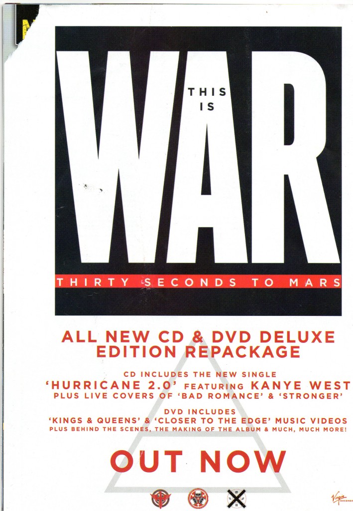
- Band Logo in the background of the advert
- Mentions of the singles/ other artists featured (Kanye West)
- Artwork of the album title/ band name
- Fairly plain white background
- Red coloured text
- Simple Serif font
- Record company logo
- "OUT NOW" in large writing
- Mention of the bonus DVD/ features
I plan on using a lot of the features of this digipak in our group's Nine Inch Nails digipak, such as; the band logo, the record company logo and details such as what singles are included and the bonus DVD. Something that doesn't feature in this magazine advert, but does often appear in others (and something we plan on including) is a number of tour dates on the advert.
KM - Examples of magazine adverts (Q)
 These Adverts all came from Q magazine, although they are all adverts for tours, the bands and song writers are aiming at the same target audience and techniques to capture the target audiences are going to be used. Q is a magazine that could include Nine Inch Nails, as they often feature a large variety of Rock/ Metal bands.
This is an advert for the band Noah And The whale. I instantly notice that the writing is black while the background is white, highlighting the contrast between the two which makes the writing stand out more and become more eye catching. The photograph itself is an artistic old fashioned photograph of the band looking deep and thoughtful, the photograph film is the same colour film that they used in the the 1960s, this is the time where great legendary bands such as the Rolling Stones and the Beatles were introduced so the film type has been used to reflect on these legendary bands and imply that this band is also this great. There are tabs of red on the poster which your eye is very quickly drawn to.

This advertisement is much more basic and less eye catching apart from the giant Funeral Party sign. A lot of this advertisement is devoted to the name of the band, this is because when a fan of this band is looking through the magazine the band want to do everything in their power to grab the fans attention and to let him know about the bands activity. I really like this style, its simple and eye catching and does not overwhelm the viewer.
Like the rest of the band advertisements, this Villagers ad features large font for the name of the band and contrasti
 ng colours laid on top of each other to catch the readers attention, this contrast of colours is something we plan to use in our NIN magazine advert, using black and white. The picture in the background is the logo of the band so if the fan does not get drawn to the giant “Villagers” letters they will get drawn to the logo. This can be very useful tip when creating our advertisement, if I make the screenshot from our video that we plan to use in the ad large as well as having large lettering for the Nine Inch Nails logo then at least one of them will be eye catching and draw in a viewer. The picture also has to be interesting to draw in the members of the public who are not already fans, like this one.
Sunday, 29 January 2012
Wednesday, 25 January 2012
HK: Digipak Research AC/DC
It is good to look at more genre specific examples to see if there is any codes and conventions that the follow.
The front cover is quite simple, no photo but just a brown/grey textured back ground no real use of colour.
It is clear who the album is by and that the artist is AC/DC as it has the band logo taking most of the focus in a large font at the top of the cover.
Below this in a smaller, darker font written all in capitals is the album name 'BACK IN BLACK'
It isn't a very glamorous or glossy cover at all, no use of colours or bright images that are usually on digipaks to attract people to the CD and make it eye catching in shops.
There is a very large sticker which takes up almost a quarter of the front cover, this says information about what is inside the digipak like what singles it includes and how it has been digitally remastered.
The Inside
The inside of the digipak on the inner let panel has photo's of all four band members with the names of them in the photo's these photos have been shot or edited into a colour effect that fits the colour theme of the digipak.
On the right panel is the CD which is similar to the front cover and has the same sort of texture effect on it.
The Back
Is pretty much the same as the back, it has the same brown texture, no colour or images.
On the back is the list of tracks in the album.
Below this is copyright information, information and credits about who digitally remastered the CD.
 The adress for AC/DC's website. There are two logos of the record company and the production company.
A scannable bar code is located in the top right for sales purposes.
Subscribe to:
Posts (Atom)