 |
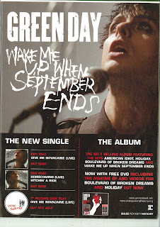
| Green Day Magazine Advert |
- Screenshot from the video for the single
- Information about the album and single
- Release dates
- Image of album cover
- Use of red and white font
- Band name in large white font
- Information about the included DVD
- Record company logo
- Official website information
This magazine advert is split in two, with the main focus of the top half being an image from the performance section of the video for "Wake Me Up When September Ends", and the band/ song name. The bottom half of the ad features all the information about what is included with the album/single. It's structured in this way so that the viewers attention is caught by the large image and this encourages them to read the details in the bottom half of the advert.
No comments:
Post a Comment
All comments are moderated.