 |
| David Fincher |
Wednesday, 18 January 2012
KM - David Fincher (Director)

HK - DigipakEG 3: Bryan Adams
 The third digipak i looked at was by Bryan Adams, this was a quite obscure one.
The cover photo is a piece of metal that has the album name stamped into it, the text doesn't line up and is pretty sketchy giving a cross a more thrashy/low budget look to the album.
Other than this the only other thing on the cover is the name of the artist in a black font that stands out against the silver background image.
The spine is simple with just serial number, album and artist name. In a simple black font.
The back of the digipak has an background image that is a picture of a hand with a ring on and on the ring says '18 Till I Die' so it now becomes apparrent what the image on the front cover was.
There is a close upphoto of Bryan Adams slap bang in the middle of the back cover and above this has information on where the tracks on the cd were recorded with the 18 Till I Die always in a larger font.
There is of course a bar code this is placed in the top right which is different to most as they are usually located in a bottom corner.
There are production company logo's and also copyright information about the CD.
HK - DigipakEG2: Jack Johnson
 The second Digipak I looked at was Jack Johnsons's: In Between Dreams album.
The album has a simplistic yet striking feel to it the black and yellow theme makes it stand out.
In the top right hand corner we have the artist and album name the artist name in a black san serif font that stands out against the yellow background making it very easy to identify which artist the album is from.
The tree looks like a real life tree that has been has been edited to have a sort of cartoon style effect.
Below the centre image of the tree in the bottom left of the cover is a SPECIAL EDITION sticker in silver, the sticker is actually a reflective material which would catch your eye if you saw it in a store.
There is another thing in the top right that looks like a sticker but is actually printed on giving information about what tracks are in the albumn.
The Spine is very simple with just the yellow logo and a tiny bit of the image of the tree still on. The album and artist name a serial number and a very small record label logo at the bottom.
The back is very very simple pretty much just a plain yellow cover but with a graphic of a tree trunk.
It has song info on the back but not the times of the songs which often appears in some digipaks.
as standard there is a barcode on the back.
Two production company logos are shown on the back and also there a three websites.
Production company website, Jack Johnsons Website and a website for a charity organisation.
HK - DigipakEG1: Ignacio Fernandez
I have been doing some research into digipaks recently as it a task for our coursework to create a digipak for our track.
 The first digipak I looked at was of Ignacio Fernandez.
It had a very simplistic cover photo just a medium long shot photograph of the artist with his guitar leant against a plain orange wall.
It doesn't follow normal conventions of digipaks which usually have more than just an image they usually have stickers or more text on the front such as album or artist name, sometimes have parental guidance warnings or other logos.
The Spine is still quite simplistic with just a white background no effects just the white background and the text that says the artist name in red and the album name in a light orangey yellow.
REAR PANEL (EXTERNAL) The back of the digipak has more on it, but is still pretty basic, just a creamy white plain background but with a lot of text again we have the artist and album name in red and yellow but these at the top in a larger font stand out more than the rest of the text below that is in smaller writing except from the track names that are in a bold red font as appose to the smaller black font that gives some description about the album written in spanish above.
Below the track list is credits with the names of people who play what instrument, the instrument written in a small font whilst the names of the musicians is in a black bold font to make the names stand out.
At the bottom below the credits are some of the company and production LOGOs we have the logo for CM records in the bottom centre with a brief bit of copyright information.
To the left of this is the technical producers the people who made the cd with the enhanced CD logo.
and below this is the web adress to Ignacio Fernadez's official website.
In the bottom right is a bar code which is usually on every digipak as it is required for when selling them in shops.

It had a very simplistic cover photo just a medium long shot photograph of the artist with his guitar leant against a plain orange wall.
It doesn't follow normal conventions of digipaks which usually have more than just an image they usually have stickers or more text on the front such as album or artist name, sometimes have parental guidance warnings or other logos.
The Spine is still quite simplistic with just a white background no effects just the white background and the text that says the artist name in red and the album name in a light orangey yellow.
REAR PANEL (EXTERNAL) The back of the digipak has more on it, but is still pretty basic, just a creamy white plain background but with a lot of text again we have the artist and album name in red and yellow but these at the top in a larger font stand out more than the rest of the text below that is in smaller writing except from the track names that are in a bold red font as appose to the smaller black font that gives some description about the album written in spanish above.
Below the track list is credits with the names of people who play what instrument, the instrument written in a small font whilst the names of the musicians is in a black bold font to make the names stand out.
At the bottom below the credits are some of the company and production LOGOs we have the logo for CM records in the bottom centre with a brief bit of copyright information.
To the left of this is the technical producers the people who made the cd with the enhanced CD logo.
and below this is the web adress to Ignacio Fernadez's official website.
In the bottom right is a bar code which is usually on every digipak as it is required for when selling them in shops.
KM - Research into magazine advertisements
 |
| Example of magazine advert |

Thursday, 12 January 2012
BH- Mark Romanek
Mark Romanek has worked with Nine Inch Nails on two music videos, such as Closer & The Perfect Drug, both of which where high budget videos and Closer was one of the more prolific videos for Nine Inch Nails courting a fair amount of controversy because of the nudity and the depictions of a monkey on the cross (obviously relating to the religious connotations).
Reznor was also asked to score his film The One Hour Photo however the studio (Fox) believed Reznor to be the wrong choice and subsequently decided that he was the wrong cho canned his soundtrack for the film.
He also directed the music video to Jonny Cash's music video to his cover of NiN-Hurt, so obviously he has a fair amount of history with the band.
His music video for A Perfect Drug was very gothic with a blue tint to make it feel much darker visually colder too. The gothic one is something shared with the Closer video, both of which featuring abstract visuals, with Closers style helped via the 20's Film reel used for filming the video, giving it a more sepia feel.
Reznor was also asked to score his film The One Hour Photo however the studio (Fox) believed Reznor to be the wrong choice and subsequently decided that he was the wrong cho canned his soundtrack for the film.
He also directed the music video to Jonny Cash's music video to his cover of NiN-Hurt, so obviously he has a fair amount of history with the band.
His music video for A Perfect Drug was very gothic with a blue tint to make it feel much darker visually colder too. The gothic one is something shared with the Closer video, both of which featuring abstract visuals, with Closers style helped via the 20's Film reel used for filming the video, giving it a more sepia feel.
Tuesday, 10 January 2012
KM - Performance filming

This weekend we will be filming our performance scene in Ilkley, we are thinking about filming up near the cow and calf, using basic equipment (2 guitars, amps, microphone and basic drum-kit) to contrast with the technology based narrative of the video. We have several people in mind, however nothing is final and we're still discussing this.
Thursday, 5 January 2012
KM - Digipaks

Wednesday, 28 December 2011
BH- Examples of digipaks 1
The Beatles- Love
The background, made up of orange swirls and the generally textured look to the cover give it a very 'retro' feel which is appropriate for The Beatles. The warm colours are also indicative of the genre, the light colours would seem to signify psychedelic-rock.
The rear of the digipak is essentially the same kind of image only with more orange textures. Also all the copyright notices and credits appear here. Something to note is the lack of song titles on the rear. This would
indicate that the band are fairly big and that the audience would know what to expect from the digipak

The second inlay appears to be essentially the same but only with slightly different textures and the CD cover, a
 |
| Front |
The cover is stylised as to have the members of the Beatles as orange silhouettes coming from the title
love- which is surrounded by an orange outline. This gives it a comic book art style.
The background, made up of orange swirls and the generally textured look to the cover give it a very 'retro' feel which is appropriate for The Beatles. The warm colours are also indicative of the genre, the light colours would seem to signify psychedelic-rock.
 |
Rear |
indicate that the band are fairly big and that the audience would know what to expect from the digipak
Here we have the track listing on the inlay
we have the track listing here too, which appears to be fairly extensive, we also have a continuation of the art style, only with the band members being much a much lighter shade- which contrasts with the second CD which features darker band members, but essentially the same image.

The second inlay appears to be essentially the same but only with slightly different textures and the CD cover, a
darker colour.
Wednesday, 14 December 2011
KM - Creative Arts Evening and other feedback

Monday, 12 December 2011
KM - Nine Inch Nails in the news

Wednesday, 7 December 2011
BH: Nine Inch Nails- Perfect Drug
Director: Mark Romanek
Year: 1998
Genre: Industrial/Rock
Audience: 15-24 (24-35)
This song was originally written for David Lynch's Lost Highway (1997)
Nine Inch Nails: The Perfect Drug (1997) from Nine Inch Nails on Vimeo.
The first shot, the removal of a lens cap from a Victorian camera, into a mirror to give the effect of fish eye immediately sets the tone, the lighting is dark and tinted blue to show this idea of moodiness and a dark environment, you can see clearly that the walls are grimy and dirty. This is elaborated on in the next shot, a long shot of Reznor at 0:04 seconds, the floorboards are dirty and covered in litter, various instruments hang up behind him and he's staring at music sheets and yet he isn't actually doing anything other than staring which lends itself to the idea that the character is depressed, he's hunched forward over the piano, he'. The next shot at 0:05 is a very brief close up of the three band members playing string instruments, once again the black clothing is revealed to be a fit with the general visual style of the video. The next shot at 0:06 is Reznor by himself playing the same instruments as his band, sitting, long shot facing the camera. At 0:09, we have a medium close up of Reznor staring at the music sheets featured previously, the shot is more side on profile, we takes a deep breath and sighs, once again the indication that he's not a healthy individual. The next shot is framed interestingly. it's of a urn but only the bottom out of shot and the sky, lending the idea of a highly stylised music video.
At 0:14 it makes a return only this time the bottom is seen with a pair of legs and the rest of the body hidden, the idea being hinted at appears to be death of someone, the sky is very grey/blue. At 0:22, it's revisited again for a close up, but once again the shots are very brief, the pace of editing here is rapid.
At 0:29 the framing of the shot is very interesting because we can see half of Reznors head hidden behind a curtain as he lip sync's.
2:33 the video goes green tinted, to match with the drum solo, the pace of editing here picks up rapidly- the green tint to signify the alcohol taking control of the character. At 2:58 the video appears to take much more melancholy video with a longshot showing the full body of the character, leaning towards the camera following the melancholy.
The video is very dark throughout in terms of actual lighting, with the opened shot of the singer and a small boy looking in a mirror removing the cap of an old fashion style camera. Instantly showing that this isn't set in the modern day, reinforced by the attire of the two characters. The video prominently features abstract Victorian imagery and is overall a very 'concept' driven video- however if you watch closely you can see certain aspects of narrative- the reoccurring image of the young boy for instance throughout the video hints at some form of meaning. Listening to the lyrics in the last minute of the song it's implied that the boy has died (as indicated by the two women dressed in black) and that the father (the singer/ Trent Reznor) is in mourning and has turned to alcohol, also indicated through the green liquid shown in several extreme close up shots.
The location is VERY gothic and dark, the old Victorian esq walls, something seen in previous industrial videos, where the focus here is not on the decay of society but on the decay of the mind, as indicated though Reznors decline into alcohol abuse in the video.
As indicated by the abisinth seen in select shots. There are several long shots of the father, often alone or staring into the distance at something out of shots, as the video goes on these shots are often revisited for close-ups to put emphases on the isolation of the character, in several shots however he appears to be hidden or hiding (i.e the water shots and curtain ones.)
At the time the video was fairly expensive with the refrigerated set used and the renting of certain artworks featured throughout the video, these led to a reported $1million music video.
Year: 1998
Genre: Industrial/Rock
Audience: 15-24 (24-35)
This song was originally written for David Lynch's Lost Highway (1997)
Nine Inch Nails: The Perfect Drug (1997) from Nine Inch Nails on Vimeo.
 |
| The decayed/gothic setting of the video. |
At 0:14 it makes a return only this time the bottom is seen with a pair of legs and the rest of the body hidden, the idea being hinted at appears to be death of someone, the sky is very grey/blue. At 0:22, it's revisited again for a close up, but once again the shots are very brief, the pace of editing here is rapid.
At 0:29 the framing of the shot is very interesting because we can see half of Reznors head hidden behind a curtain as he lip sync's.
2:33 the video goes green tinted, to match with the drum solo, the pace of editing here picks up rapidly- the green tint to signify the alcohol taking control of the character. At 2:58 the video appears to take much more melancholy video with a longshot showing the full body of the character, leaning towards the camera following the melancholy.
 |
| An example of the abstract imagery |
The location is VERY gothic and dark, the old Victorian esq walls, something seen in previous industrial videos, where the focus here is not on the decay of society but on the decay of the mind, as indicated though Reznors decline into alcohol abuse in the video.
 |
| Abisinth close-up. hinting at the 'meaning' |
 |
| A med-close up showing the father looking out of shot. |
At the time the video was fairly expensive with the refrigerated set used and the renting of certain artworks featured throughout the video, these led to a reported $1million music video.
KM - "KMFDM - Megalomaniac" Deconstruction
Artist: KMFDM
Song Title: Megalomaniac
Genre: Industrial Metal
Year: 1997
Primary Audience: Male 15-24
- The video starts off with film like titles and opening credits, displaying the actors featured in the video. These are shown while the track is already being played in the background.
- From 0:53 to 1:08 there is a continuous close up shot of the vocalist lip-syncing, as the shot goes on it is edited in a number of ways, such as the focus being adjusted, the lighting being altered, and binary code being displayed on a separate video layer over the top.
- At 1:11 a stop-motion video effect is used of a policeman beating a man with a baton, (before they end up kissing) and cutting from words like "fake", "malicious", and "marijuana". These words, along with the homosexual aspect signify the rebellious and controversial motif of the song.
- A 'fish eye lens' is used at 1:17, which is something we have already incorporated into the sample footage for our music video, for when our protagonist is walking over a bridge.
 - Laura Mulvey's 'male gaze' theory is relevant in this video at 1:21, where a woman wearing heavy make up and a revealing nurses uniform is the centre of the shot, before cutting to a shot of her dancing in a capsule labelled "EXTRA STRENGTH KMFDM 300MG". This shot links in with the lyrics as the words "better than the best" appear on screen as the words are sung.
- At 1:47 the video then gives the effect of a flight simulator/ vintage video game. This relates to the electronic sound of the music that is played at this time in the track, as it sounds like it could be the soundtrack to an old video game.

- An interesting shot used at 2:24 shows the album that the track is featured on, we have a similar idea which we are thinking of using in our video of bringing the digipak that we are going to creat into the diegetic world of the music video.
- Another shot of note occurs at 2:35 where an image of an eye appears on a TV screen in shot, I have noticed similar shots of eyes in other videos of the Industrial metal genre, such as "Stigmata" by Ministry, on which I have previously blogged. This is also very similar to our own idea of displaying the illuminati "all seeing eye" on a number iMac screens.
- The controversial theme of this video is again displayed at 2:38 where there is an on screen animation of a man choking someone with a wire, this is continued at 2:52 with a scene where there is an implied killing of a man with an electric drill, and at 4:00 with the nurse smothering a patient.
- There is no full band performance, but there are aspects of individual performance, such as the vocalist lip syncing throughout, and close ups of instruments being played, such as the guitar fretboard at 3:34.
Song Title: Megalomaniac
Genre: Industrial Metal
Year: 1997
Primary Audience: Male 15-24
 |
| Fish eye lens |
- From 0:53 to 1:08 there is a continuous close up shot of the vocalist lip-syncing, as the shot goes on it is edited in a number of ways, such as the focus being adjusted, the lighting being altered, and binary code being displayed on a separate video layer over the top.
- At 1:11 a stop-motion video effect is used of a policeman beating a man with a baton, (before they end up kissing) and cutting from words like "fake", "malicious", and "marijuana". These words, along with the homosexual aspect signify the rebellious and controversial motif of the song.
- A 'fish eye lens' is used at 1:17, which is something we have already incorporated into the sample footage for our music video, for when our protagonist is walking over a bridge.
 - Laura Mulvey's 'male gaze' theory is relevant in this video at 1:21, where a woman wearing heavy make up and a revealing nurses uniform is the centre of the shot, before cutting to a shot of her dancing in a capsule labelled "EXTRA STRENGTH KMFDM 300MG". This shot links in with the lyrics as the words "better than the best" appear on screen as the words are sung.
- At 1:47 the video then gives the effect of a flight simulator/ vintage video game. This relates to the electronic sound of the music that is played at this time in the track, as it sounds like it could be the soundtrack to an old video game.

- An interesting shot used at 2:24 shows the album that the track is featured on, we have a similar idea which we are thinking of using in our video of bringing the digipak that we are going to creat into the diegetic world of the music video.
- Another shot of note occurs at 2:35 where an image of an eye appears on a TV screen in shot, I have noticed similar shots of eyes in other videos of the Industrial metal genre, such as "Stigmata" by Ministry, on which I have previously blogged. This is also very similar to our own idea of displaying the illuminati "all seeing eye" on a number iMac screens.
- The controversial theme of this video is again displayed at 2:38 where there is an on screen animation of a man choking someone with a wire, this is continued at 2:52 with a scene where there is an implied killing of a man with an electric drill, and at 4:00 with the nurse smothering a patient.
- There is no full band performance, but there are aspects of individual performance, such as the vocalist lip syncing throughout, and close ups of instruments being played, such as the guitar fretboard at 3:34.
Tuesday, 6 December 2011
KM - "Ministry - Stigmata" Deconstruction
Artist: Ministry
Song Title: Stigmata
Genre: Industrial Metal
Year: 2005
Primary Audience: Male 15-24
- Black and white footage is used throughout the video, which is something we are going to implement in our music video and this effect is often used in videos of the industrial metal genre.
- Multiple video layers are used, for example at 0:13, we are thinking about using this idea in our music video and are going to experiment with it and our newly filmed sample footage.
- There are religious references in the video such as the cross at 0:14. This common convention that I have noticed in several industrial metal videos, such as 'Nine Inch Nails - Closer'.
- Footage is slowed down at 0:22 for a long take, to signify a flashback.
- Live band performance footage is used frequently (0:50).
- An interesting POV shot is used at 0:44, we experimented with a similar POV shot today (6th December) during our sample filming in Ilkley.
 - There are a lot of shaky, fast moving camera shots used, for example at 0:54, this helps signify the live performance setting. Blurry footage is also used for the same effect, for example at 1:06.
- There is a change at 1:12 in the video, as the camera erratically zooms in and out and shakes, this is to fit in with the double bass drum beat which kicks in at the same time.
- Sped up footage is used at 1:26, to signify the atmosphere of the live setting, this features again on many occasions such as at 1:34.
- Footage of machinery is shown at 1:45, linking in to the 'Industrial' genre, as songs from this genre often feature the sound of machinery.
 - A very unusual section of this music video is from 2:08 to 2:21, where very fast pace editing is used to cycle through many different eye shots, which links in to the lyrics: "The look in your eyes..." This is a similar idea to a scene that we are planning to use for our music video, which is where our protagonist is in a room full of iMac computers, all with the illuminati "all seing eye" on screen.
Here is a link to the official video, as it can't be embedded.
Song Title: Stigmata
Genre: Industrial Metal
Year: 2005
Primary Audience: Male 15-24
- Black and white footage is used throughout the video, which is something we are going to implement in our music video and this effect is often used in videos of the industrial metal genre.
 |
| Machinery |
- There are religious references in the video such as the cross at 0:14. This common convention that I have noticed in several industrial metal videos, such as 'Nine Inch Nails - Closer'.
- Footage is slowed down at 0:22 for a long take, to signify a flashback.
- Live band performance footage is used frequently (0:50).
- An interesting POV shot is used at 0:44, we experimented with a similar POV shot today (6th December) during our sample filming in Ilkley.
 - There are a lot of shaky, fast moving camera shots used, for example at 0:54, this helps signify the live performance setting. Blurry footage is also used for the same effect, for example at 1:06.
- There is a change at 1:12 in the video, as the camera erratically zooms in and out and shakes, this is to fit in with the double bass drum beat which kicks in at the same time.
- Sped up footage is used at 1:26, to signify the atmosphere of the live setting, this features again on many occasions such as at 1:34.
- Footage of machinery is shown at 1:45, linking in to the 'Industrial' genre, as songs from this genre often feature the sound of machinery.
 - A very unusual section of this music video is from 2:08 to 2:21, where very fast pace editing is used to cycle through many different eye shots, which links in to the lyrics: "The look in your eyes..." This is a similar idea to a scene that we are planning to use for our music video, which is where our protagonist is in a room full of iMac computers, all with the illuminati "all seing eye" on screen.
Here is a link to the official video, as it can't be embedded.
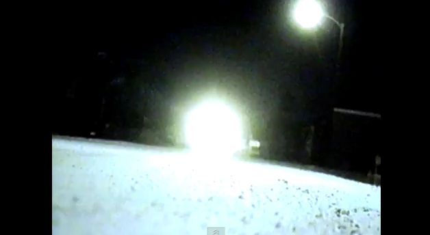 |
| POV shot. |
BH- Radio 1
...have conducted an interview with Mr. Reznor today (5/12/11) with the chit-chat mainly focusing on his upcoming The Girl with The Dragon Tattoo film score although there where other small bits of information released, he is releasing a full length How To Destroy Angels album early next year (hopefully) and he let slip that he's been offered some live show's although he didn't go into much detail on the matter he did indicate he was still working it out.
But the real killer here is the news that in 2012 he'll be writing with a much more NiN orientated stuff...

But the real killer here is the news that in 2012 he'll be writing with a much more NiN orientated stuff...

KM - Sample filming

Monday, 5 December 2011
KM - "Nine Inch Nails - Head Like A Hole" Deconstruction
Artist: Nine Inch Nails
Song Title: Head Like A Hole
Genre: Industrial Metal
Year: 1989
Director: Eric Zimmerman
Primary Audience: Male 15-24
- This is a performance/ concept based music video that features the band performing live, at a gig scenario but also in a cage.
- An out of focus shot is used to start the video (0:01), this is something that I have noticed in other Nine Inch Nails videos, such as 'The Hand That Feeds', on which I have previously posted.
- Abstract, conceptual imagery is another aspect that is utilised in this video, as well as others from the same band, such as the man with silver face paint on, who's rotating head keeps being cut to from 1:50 - 1:53.
- The video features a guest drummer, Martin Atkins, who is performing with the band, as shown at 0:19.
- All the band members are wearing dirty, gritty clothing throughout the video.
-There are images that are shown for a few frames like "HEAD," "16 SOUND START," "S M P T E UNIVERSAL LEADER" and "PICTURE." Other images included a white dot set againist a black background, a mirrored presentation showing the words "REEL № PROD № PLAY DATE" colored in yellow, one with the words "PICTURE START," and a frame consisting of "C C F F" placed near a outlined ring. Source - Wikipedia

- At 2:33 a silver tint and distortion effect is used to add a psychedelic effect to the video. Different colour tints I have noticed seems to be a common convention of Nine Inch Nails videos.
- From 2:40 the shot repeatedly cuts back and forth from one drummer to the other in time with the beat, an interesting point is the fact that the shot breaks the 180 degree rule, so it appears as if it could be the same drummer, adding some narrative enigma to the video.
- At 2:58 the shot of the man on his knees in shot directly links to the lyrics of the track, as this occurs while Trent Reznor is singing the line "bow down before the one you serve". Relating what is shown on screen with the lyrics is a common convention of not just Industrial Metal as a genre, but of music video as a format.
- From 3:45 there is a repeated shot sequence used: a slow pan, followed by a very quick pan, followed by a slow pan etc. This is fitted in time with the beat, as the fast pan comes on every snare drum hit.
Song Title: Head Like A Hole
Genre: Industrial Metal
Year: 1989
Director: Eric Zimmerman
Primary Audience: Male 15-24
 |
| Band performance |
- This is a performance/ concept based music video that features the band performing live, at a gig scenario but also in a cage.
- An out of focus shot is used to start the video (0:01), this is something that I have noticed in other Nine Inch Nails videos, such as 'The Hand That Feeds', on which I have previously posted.
- Abstract, conceptual imagery is another aspect that is utilised in this video, as well as others from the same band, such as the man with silver face paint on, who's rotating head keeps being cut to from 1:50 - 1:53.
- The video features a guest drummer, Martin Atkins, who is performing with the band, as shown at 0:19.
- All the band members are wearing dirty, gritty clothing throughout the video.
-There are images that are shown for a few frames like "HEAD," "16 SOUND START," "S M P T E UNIVERSAL LEADER" and "PICTURE." Other images included a white dot set againist a black background, a mirrored presentation showing the words "REEL № PROD № PLAY DATE" colored in yellow, one with the words "PICTURE START," and a frame consisting of "C C F F" placed near a outlined ring. Source - Wikipedia

- At 2:33 a silver tint and distortion effect is used to add a psychedelic effect to the video. Different colour tints I have noticed seems to be a common convention of Nine Inch Nails videos.
- From 2:40 the shot repeatedly cuts back and forth from one drummer to the other in time with the beat, an interesting point is the fact that the shot breaks the 180 degree rule, so it appears as if it could be the same drummer, adding some narrative enigma to the video.
- At 2:58 the shot of the man on his knees in shot directly links to the lyrics of the track, as this occurs while Trent Reznor is singing the line "bow down before the one you serve". Relating what is shown on screen with the lyrics is a common convention of not just Industrial Metal as a genre, but of music video as a format.
- From 3:45 there is a repeated shot sequence used: a slow pan, followed by a very quick pan, followed by a slow pan etc. This is fitted in time with the beat, as the fast pan comes on every snare drum hit.
Sunday, 4 December 2011
"Ministry - No W" Deconstruction
Artist: Ministry
Song Title: No W
Genre: Industrial Metal
Year: 2004
Audience: Male 15-24
 - The video is performance/ concept based, and features the full band performing in a desert.
- The video features an actor in a plastic George Bush mask dancing (0:28), as well as frequent edited pictures of Bush (0:08), often with a voice-over saying things like "evil". This kind of 'anti-capitalist' message is a common convention of the industrial metal genre.
- Some of the shot have had the borders edited so there is a black outline, this gives the effect of a TV screen, for example when the actor in the George Bush mask is standing in front of the American flag at 1:45
- Multiple video layers are also a feature that is used in this video, such as at 0:05, this is something that we are going to incorporate into our Nine Inch Nails music video.
- At the start of the video most of the shots have a blurred effect up until about 0:12, these kinds of blurry shots are something that I have noticed in several Industrial metal videos, such as "Stigmata" by Ministry.
 - The clothing that the band members wear are typical for not just the Industrial genre, but for metal as a whole, for example the sleeveless tops, big boots and dark sunglasses.
- The band performance scene challenges the conventions of Industrial metal videos is a way, as the common performance location for a video of this genre would be a simulated, indoor gig environment, in a generally quite small space, such as the small rehearsal space used in "The Hand That Feeds" by Nine Inch Nails.
- An interesting sequence of shots occurs at 3:02, where the same long shot of the band performance is used, but the band members suddenly switch places.
- Something that I have observed as a common convention of music video as a format is when the focus of a certain part of a track is on one instrument, the video usually reflects this, and this occurs here, for example at 0:49 where the main focus of the music is the guitar riff, and a close up of the guitar is shown on screen.
- There are certain actions performed by the band members that reinforce the rebellious and aggressive nature of the band/song, such as the vocalist spitting on the ground at 1:14.
Song Title: No W
Genre: Industrial Metal
Year: 2004
Audience: Male 15-24
 - The video is performance/ concept based, and features the full band performing in a desert.
- The video features an actor in a plastic George Bush mask dancing (0:28), as well as frequent edited pictures of Bush (0:08), often with a voice-over saying things like "evil". This kind of 'anti-capitalist' message is a common convention of the industrial metal genre.
- Some of the shot have had the borders edited so there is a black outline, this gives the effect of a TV screen, for example when the actor in the George Bush mask is standing in front of the American flag at 1:45
- Multiple video layers are also a feature that is used in this video, such as at 0:05, this is something that we are going to incorporate into our Nine Inch Nails music video.
- At the start of the video most of the shots have a blurred effect up until about 0:12, these kinds of blurry shots are something that I have noticed in several Industrial metal videos, such as "Stigmata" by Ministry.
 - The clothing that the band members wear are typical for not just the Industrial genre, but for metal as a whole, for example the sleeveless tops, big boots and dark sunglasses.
- The band performance scene challenges the conventions of Industrial metal videos is a way, as the common performance location for a video of this genre would be a simulated, indoor gig environment, in a generally quite small space, such as the small rehearsal space used in "The Hand That Feeds" by Nine Inch Nails.
- An interesting sequence of shots occurs at 3:02, where the same long shot of the band performance is used, but the band members suddenly switch places.
- Something that I have observed as a common convention of music video as a format is when the focus of a certain part of a track is on one instrument, the video usually reflects this, and this occurs here, for example at 0:49 where the main focus of the music is the guitar riff, and a close up of the guitar is shown on screen.
- There are certain actions performed by the band members that reinforce the rebellious and aggressive nature of the band/song, such as the vocalist spitting on the ground at 1:14.
KM - "Marilyn Manson - Antichrist Superstar" Deconstruction
Artist: Marilyn Manson
Song Title: Antichrist Superstar
Genre: Industrial Metal
Year: 1998
Primary Audience: Male 15-24
 - This video consists of solely live, performance footage of the band on stage, band often decide to do this, as it saves the costs of creating a traditional music video.
- The video contains many Nazism references, such as the banners coming down behind Manson as he stands at the podium
- All the band members are wearing dark, Gothic clothing throughout the video, which is a common convention of the Industrial metal genre, as it is closely related to the Gothic rock genre.
- The editing at the start of the video links the shot cutting to the beat of the song, this is commonly done in rock/metal music videos.
- The main focus of the performance footage is Marilyn Manson himself, as focusing on the vocalist with many close ups/medium close ups is a common convention of music video as a format
- Multiple video layer are used in this video on many occasions, such as at 0:58and 1:06 where is shows a shot of Manson over the top of shots of the crowd. This effect is something that we can also achieve in editing by using the Final Cut software.
- There are a number of shots filmed from the crowd, theses shots are shaky and slightly out of focus to give the effect of being in the audience, such as at 1:27
 - Manson very controversially rips pages out of a bible, before throwing it into the crowd at 1:59, relating to the name of the track 'Antichrist Superstar' rebellious acts like this are something that I have noticed in most of the Industrial metal videos I have deconstructed.
- All the instruments used are generally associated with the genre of Industrial Metal; electric guitar, bass, drums, keyboard etc.
- An interesting shot is shown on screen at 3:14, where there is a narrowed shot of Manson shown in the centre of the screen over the top of one of the standard wide screen crowd shots.
Song Title: Antichrist Superstar
Genre: Industrial Metal
Year: 1998
Primary Audience: Male 15-24
- This video consists of solely live, performance footage of the band on stage, band often decide to do this, as it saves the costs of creating a traditional music video.- The video contains many Nazism references, such as the banners coming down behind Manson as he stands at the podium
- All the band members are wearing dark, Gothic clothing throughout the video, which is a common convention of the Industrial metal genre, as it is closely related to the Gothic rock genre.
- The editing at the start of the video links the shot cutting to the beat of the song, this is commonly done in rock/metal music videos.
- The main focus of the performance footage is Marilyn Manson himself, as focusing on the vocalist with many close ups/medium close ups is a common convention of music video as a format
- Multiple video layer are used in this video on many occasions, such as at 0:58and 1:06 where is shows a shot of Manson over the top of shots of the crowd. This effect is something that we can also achieve in editing by using the Final Cut software.
- There are a number of shots filmed from the crowd, theses shots are shaky and slightly out of focus to give the effect of being in the audience, such as at 1:27
 - Manson very controversially rips pages out of a bible, before throwing it into the crowd at 1:59, relating to the name of the track 'Antichrist Superstar' rebellious acts like this are something that I have noticed in most of the Industrial metal videos I have deconstructed.
- All the instruments used are generally associated with the genre of Industrial Metal; electric guitar, bass, drums, keyboard etc.
- An interesting shot is shown on screen at 3:14, where there is a narrowed shot of Manson shown in the centre of the screen over the top of one of the standard wide screen crowd shots.
Saturday, 3 December 2011
KM - "Nine Inch Nails - Closer" Deconstruction
Artist: Nine Inch Nails
Song Title: Closer
Year: 1994
Genre: Industrial Metal
Director: Mark Romanek
- At the very start of the music video, a film-like title is used, showing the band and song name.
- At 0:20 there is a close up of the vocalist, Trent Reznor's silhouetted face, close ups of the vocalist is a common convention of not just Industrial Metal, but of the format of music video as a whole.
 - Religious references are featured, such as in form of the monkey on the crucifix, with lit candles in front which shown on many occasions throughout the video (0:57)
- Animals are a main theme of the video, for example the pig's rotating head (1:59), the monkey (1:08), the cockroaches (0:24), and the big pieces of meat hanging on hooks behind Reznor as he's performing (1:35).
- Interestingly, the vocalist (Trent Reznor) is the only band member who appears in the video, as there is no standard band performance footage.
- An interesting effect that features is that it is edited to look like it was filmed using very old cameras, as the video contains 'cigarette burns'.
Song Title: Closer
Year: 1994
Genre: Industrial Metal
Director: Mark Romanek
- At the very start of the music video, a film-like title is used, showing the band and song name.
- At 0:20 there is a close up of the vocalist, Trent Reznor's silhouetted face, close ups of the vocalist is a common convention of not just Industrial Metal, but of the format of music video as a whole.
 - Religious references are featured, such as in form of the monkey on the crucifix, with lit candles in front which shown on many occasions throughout the video (0:57)
- Animals are a main theme of the video, for example the pig's rotating head (1:59), the monkey (1:08), the cockroaches (0:24), and the big pieces of meat hanging on hooks behind Reznor as he's performing (1:35).
- Interestingly, the vocalist (Trent Reznor) is the only band member who appears in the video, as there is no standard band performance footage.
- An interesting effect that features is that it is edited to look like it was filmed using very old cameras, as the video contains 'cigarette burns'.
KM - "Godflesh - Slavestate" Deconstruction
Artist: Godflesh
Song Title: Slavestate
Year: 1991
Genre: Industrial Metal
Director: Howard Garfield

- This is a concept video which contains no standard narrative, but has some band performance (usually just showing individual band members separately) footage thrown in, for example at 2:22.
- This video has a very psychedelic (and quite strange) theme, which is presented through the distorted video effect which is used throughout the video.
- Religious references are used occasionally in the video , such as the man near the start holding his hands out in a crucifix pose (0:05), and less indirectly at 1:01, where the words 'JESUS' appears repeatedly on screen.
- Close ups of individual body parts are used to add to the abstract feel of the video, such as the eye at 3:14, and the fist at 1:18.
- An interesting effect that is used is the changing of the width of the video on screen, for example at 1:43 when the close up of the eye comes on screen .
- Bright colours are used throughout, to add to the psychedelic theme of the video, such as the bright orange filling up the screen at 3:30.
Song Title: Slavestate
Year: 1991
Genre: Industrial Metal
Director: Howard Garfield

- This is a concept video which contains no standard narrative, but has some band performance (usually just showing individual band members separately) footage thrown in, for example at 2:22.
- This video has a very psychedelic (and quite strange) theme, which is presented through the distorted video effect which is used throughout the video.
- Religious references are used occasionally in the video , such as the man near the start holding his hands out in a crucifix pose (0:05), and less indirectly at 1:01, where the words 'JESUS' appears repeatedly on screen.
- Close ups of individual body parts are used to add to the abstract feel of the video, such as the eye at 3:14, and the fist at 1:18.
- An interesting effect that is used is the changing of the width of the video on screen, for example at 1:43 when the close up of the eye comes on screen .
- Bright colours are used throughout, to add to the psychedelic theme of the video, such as the bright orange filling up the screen at 3:30.
Subscribe to:
Posts (Atom)